Class: Art165 - Publication Design
Project: Magazine Layout
As part of my Associate's in Graphic Communications degree, I completed a Publication Design course, in which we covered ~ a lot ~ of projects. From small resume logos to multi-page magazines, we learned how to build the base in InDesign, create visually engaging images and carefully construct the materials for easy printing.

For this project, we were given the text - thankfully, I did not have to write the article myself, that is definitely not where my skills lie. We were also given a few specifications, including margins on the border, text size, font, and page requirements. Other than that, everything was up to us!
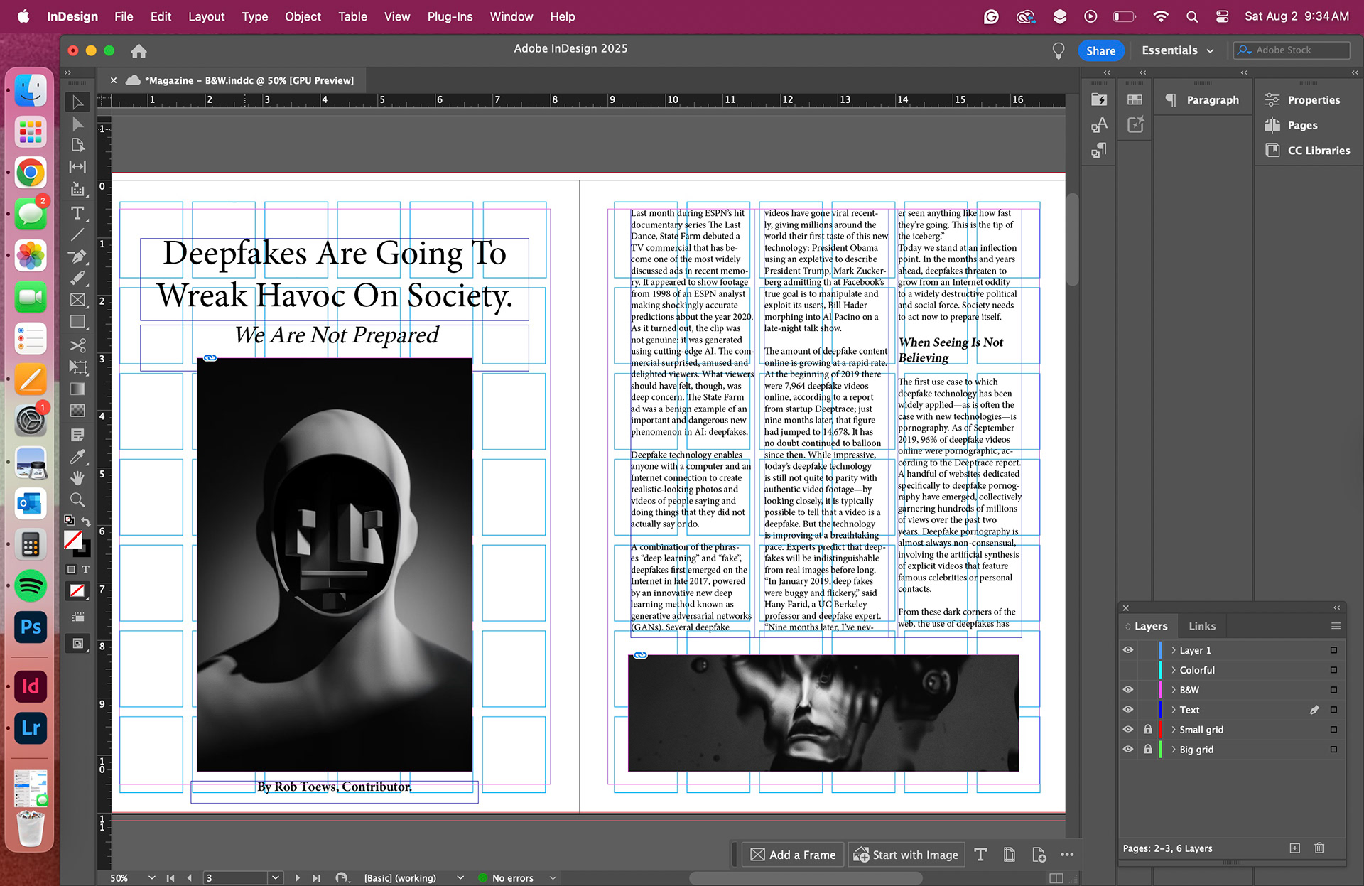
Since the material was on AI, I wanted a visual tone that would relate to the idea of artificial intelligence. My original idea was to do a black and white design, with no color whatsoever, and create a sort of haunting feel. This was my first attempt at the B&W design:
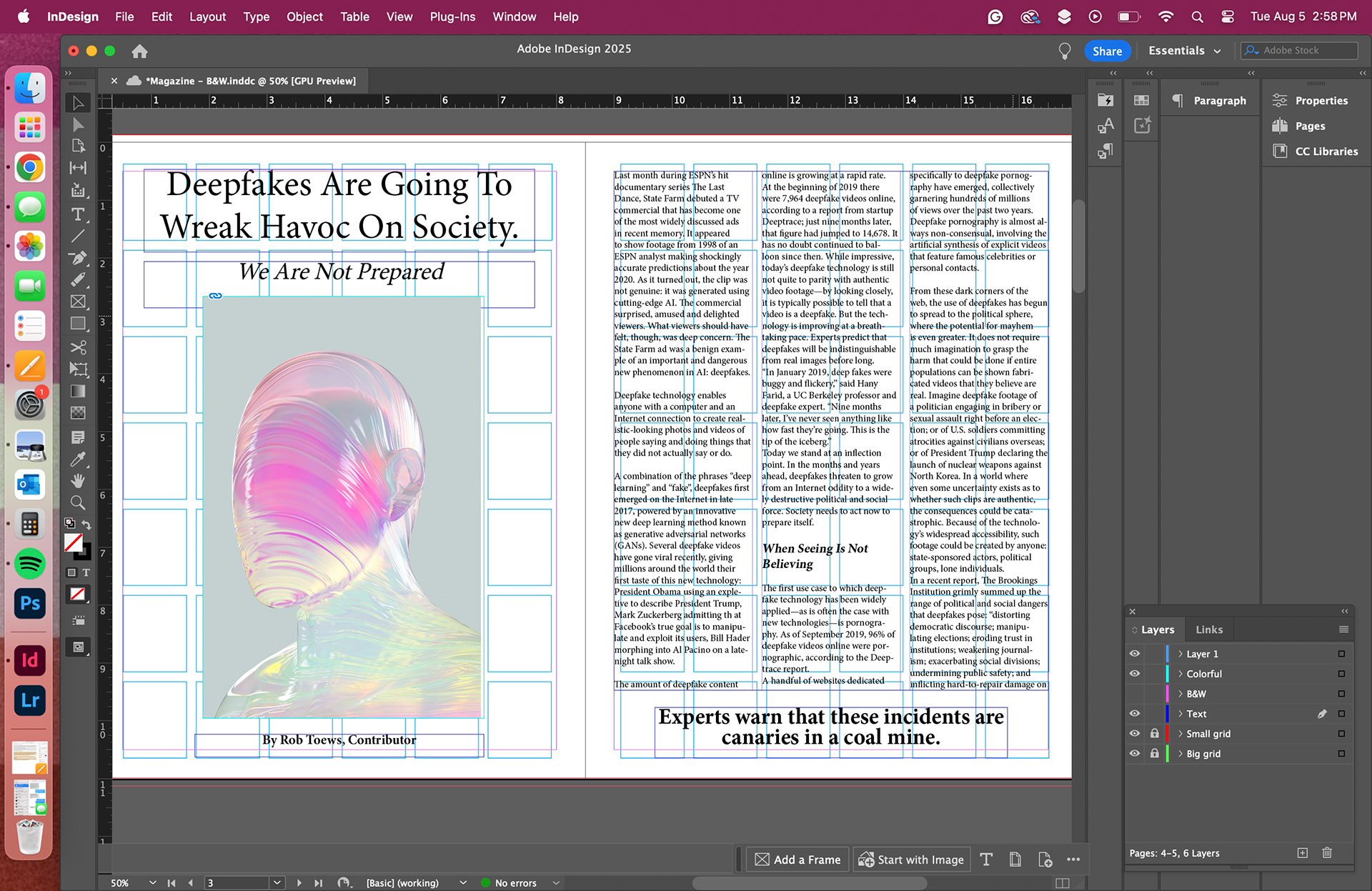
During our first class critique, in which I shared the above image and the article's cover image, I received feedback that most of the students preferred the holographic/multicolored graphic over the B&W versions.
I took their advice and continued with the assignment. I knew I wanted some more color within the magazine pages, but I wanted to ensure three things when deciding on graphics:
1. Words > Images
The point of this assignment is to create a legible, engaging magazine layout that people want to read. The graphics are not the main point - the story is.
2. Simplicity
The text is pretty heavy; both in the amount of text and the subject matter. While I wanted to give the readers something visually interesting to enjoy, I did not want to overwhelm them with too much.
3. Topic Relation
Images and graphic are a great addition to text, but they should always have a relation to what the text is saying. I didn't want to use actual deep fakes, I felt those were too easily floated around and often as clickbait. I wanted images that represented the interaction of technology and humanity.
With this in mind, I went to Unslpash, perhaps my favorite free image source site and found the images that were finally used in the completed design.


