
Project: Typographic Terms Booklet
Class: Graphic Communications 2
This project was so boring, and it ended up being my favorite project to date.
As our very first assignment in Graphic Communications 2, I was let down that we didn't get to do anything "fun" right off the bat. I wanted to make another billboard, or a deck of cards, or a website. Something that was creative and had unlimited potential. Then I saw the assignment brief that was not only rigid in the material and layout, but we were also quizzed on it throughout the class.
My first thought - I am not becoming a graphic designer just to take more quizzes.
But I started the class and I was knee deep in the degree, I wasn't backing out now. I started memorizing the material and putting together a layout and thought "if I had to read this boring pamphlet, I would at least want to enjoy looking at it."
So I went to Pinterest and put together my mood board that would reflect something I would want to see:

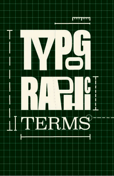
The assignment goal was to make the content make sense and my personal goal was to make the booklet enjoyable to look at. I choose a color palette I liked and I relied on architectural themes, like grids and blue prints, to help showcase the elements of the booklet's concepts.
I started with the cover of the booklet to set the tone for the rest of the pages, and I went through a handful of variations before I felt like the two themes of earth-tone colors and blueprint patterns made sense together.




Then I went into the fun layout - the Anatomy of Typography. This one didn't have as many variations, but it took more time, figuring out how to connect all this information to the word "anatomy" and keep it all on one page (part of the assignment brief, not a personal decision).


I kept the color tones throughout the pages, and then relied on the grid system and a continuous dashed line to "lead" the viewer through the booklet, as if they were being walked through a blueprint plan.
This helped create a sense of cohesion with the visual decisions that I made, as well as help me understand where the pages were going to next. Because it was fixed with screw pins, it was folded differently than a traditional book, and the pages were aligned almost backwards.
In an attempt to not overload the viewer, I alternated between color pages with cream lettering and cream pages with colorful lettering. I separated the content of the book by categories that made sense to me, and then gave each section of the book a different color from the palette, repeating the colors in a pattern to create further cohesion.
This might have been some of the more boring material I worked with during this class, but the challenge ended up being one of my favorite productions. I love the colors, the architectural theme, and am very proud of how I made something interesting out of something boring!


